Homify
An AR-powered interior design app that helps Australian renters measure, preview and furnish their space with confidence.
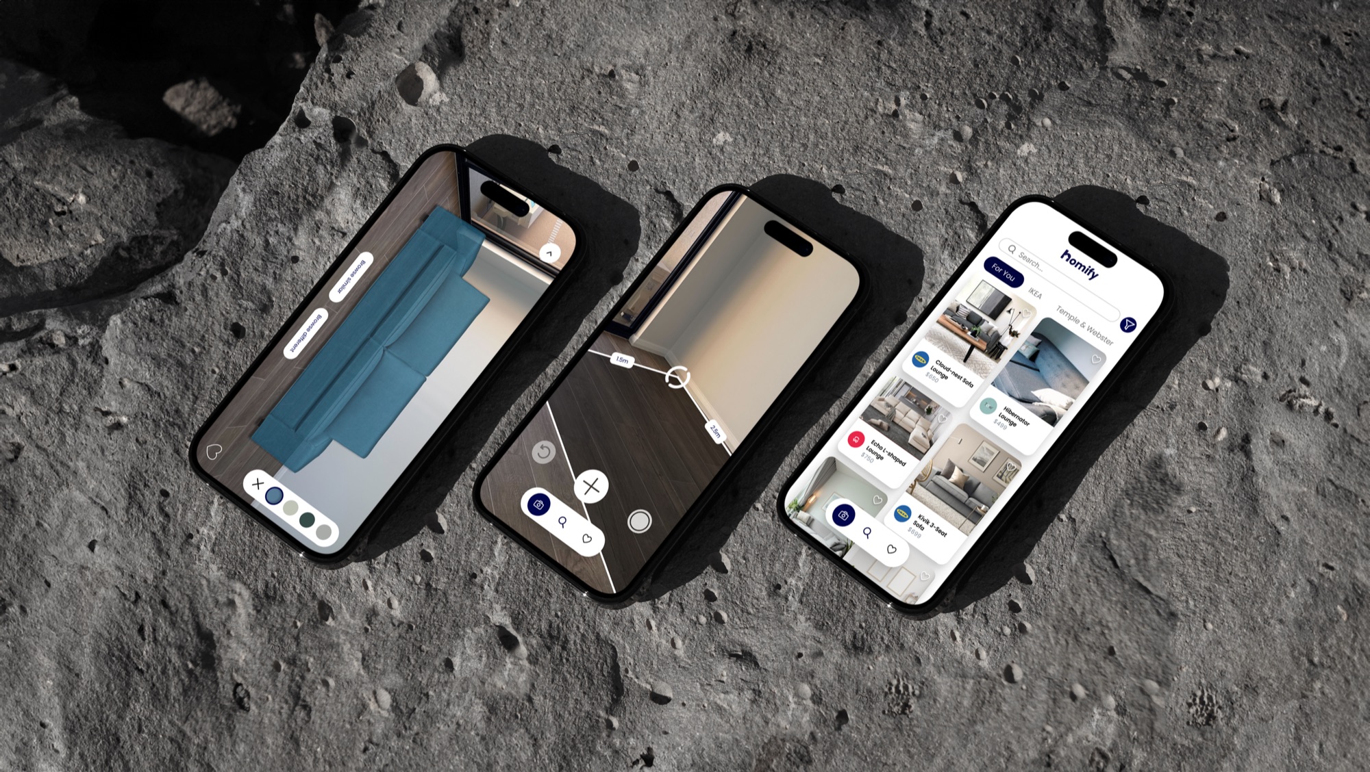
Homify is an AR-powered interior design app built for Australian renters who want to make their new space feel like home, without the guesswork, costly mistakes, or hours of frustrated scrolling. By combining space measurement, personalised furniture discovery and augmented-reality previewing into a single seamless experience, Homify turns the stress of moving into something users can actually look forward to. Homify was created during Prodigi, a program that bridges the gap between classroom learning and real-world industry experience, equipping students with the tools and connections to succeed in the product industry through practical, hands-on opportunities. It is a fictitious concept rather than a commercially shipped product.
A structured design-thinking process
As Product Manager I oversaw the design direction, coordinated team workflow and kept the product aligned with user needs throughout, contributing to research, ideation and card sorting while driving communication and milestones. The project moved from primary and secondary research, through ideation methods (Crazy 8s, storyboarding, card sorting and an impact-effort matrix), to lo-fi wireframes and on to mid- and high-fidelity prototypes in Figma, with usability testing feeding directly into the final iteration.
Australian renters face emotional stress and uncertainty when moving and furnishing, because limited information about their space undermines their confidence and turns an exciting moment into a frustrating one.
Measure with a phone
Give renters the ability to accurately measure their space using just their phone, removing the guesswork from furniture sizing.
Preview in AR
Let users preview furniture in their actual space through AR before committing, building confidence in their decisions.
Personalise discovery
Deliver a personalised 'For You' feed based on each user's stated style, budget and spatial constraints.
One end-to-end journey
Bring discovery to purchase together with a wishlist and budget tracker, in one accessible platform.
Mapping the renter experience and the market
Research had a dual focus: the emotional and practical challenges renters face when furnishing, and what existing tools did and didn't do well. A competitor analysis of IKEA Place and Apple's Measure revealed a consistent gap: each did one thing well, but neither offered an end-to-end experience, and neither curated recommendations around a user's space, style and budget. A visual moodboard helped the team align on an aesthetic direction before design began.
Desktop research
The Australian renter experience, the psychology of furniture purchasing and patterns across existing AR and interior-design apps.
User surveys
Primary research validating hypotheses and surfacing first-hand pain points from the target demographic.
Card sorting
Sessions with users to prioritise features and determine how content should be structured within the app.
Impact-effort matrix
Used to make final, evidence-based decisions on what to build for the MVP.
Defining the core problem
Synthesis surfaced three interconnected gaps and a clear persona. Chloe, a 22-year-old full-time uni student, had just moved into a rental feeling overwhelmed and anxious. Her biggest frustrations were the effort of finding what worked, furniture that didn't fit, and a room that didn't match her vision. She wanted to make the space feel like home but struggled to visualise how her furniture choices would fit and feel, and her journey map traced consistent moments of doubt, confusion and frustration at every stage.
No smart curation
Nothing curated recommendations around a renter's space, style and budget together, leaving people to piece it all together themselves.
Lack of personalisation
Furniture shopping wasn't tailored to a renter's taste, constraints or the specific room they were trying to furnish.
No end-to-end experience
No single journey carried a renter from measuring their space through to a confident purchase, so the steps stayed disconnected.
“How might we help renters emotionally connect with and feel confident in their new space, by giving them a clearer sense of how it will align with their lifestyle and needs?”
From Crazy 8s to lo-fi wireframes
Ideation began with everyone completing Crazy 8s independently before reconvening to evaluate ideas, alongside storyboards illustrating specific flows — a measurement flow, a Feng Shui game concept and a light-simulation feature. Building on the earlier prioritisation work, this converged on three core MVP features: AR space measurement, a personalised 'For You' feed and AR furniture preview.
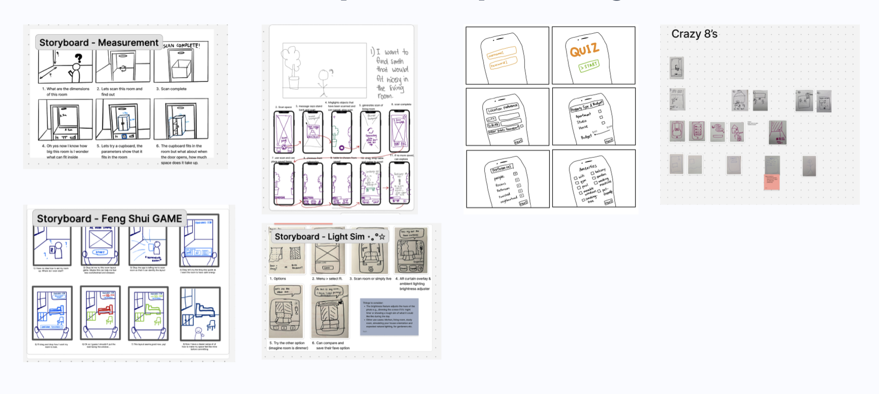
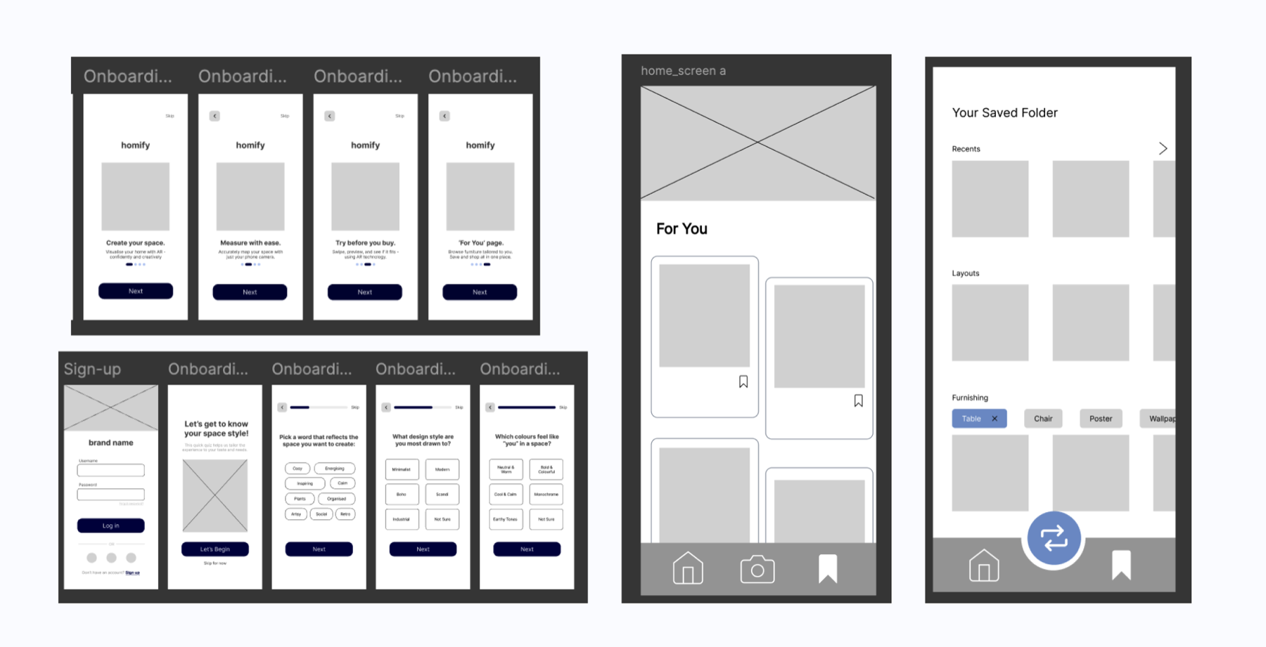
With scope locked, the three features were mapped into lo-fi wireframes covering onboarding, the 'For You' page, product pages, the measurement flow and the wishlist — the first tangible version of the end-to-end journey.
Refining in mid-fidelity
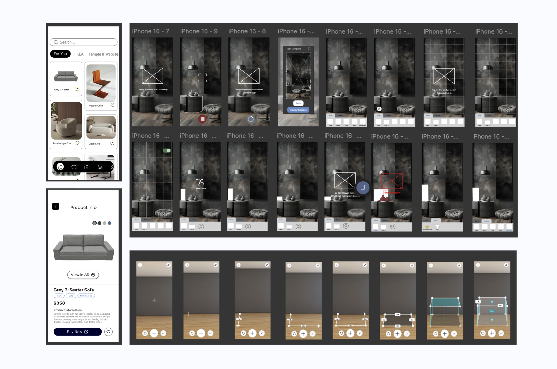
The wireframes were built up into mid-fidelity prototypes that introduced colour, type and real content, giving the team something realistic enough to put in front of users. A round of mid-fi usability testing surfaced three issues, all resolved before the high-fidelity build.
Unclear microinteraction
A solid line didn't convey movement, confusing users about what was happening.
Unfamiliar icon placement
Icons sat in unconventional locations that broke familiarity and navigation patterns.
Measurement needed a tutorial
Users couldn't use the measurement feature with confidence until a guided tutorial was added.
Think-aloud usability testing
Think-aloud usability testing with five participants provided both quantitative and qualitative insight, with a short post-test interview and SUS survey rounding out the feedback loop. The results placed Homify firmly in the 'excellent' range and directly shaped the final design.
The solution
The promise was simple: turn any space into your home, without the hassle. The experience follows four beats: understand your style through a quick preference onboarding, measure with ease using just your phone, filter your choices down to furniture you actually want, and try before you buy by previewing pieces in your real room. The final high-fidelity prototype delivered these as three tightly integrated features (measure, discover and preview), tied together by a wishlist and budget tracker and extended to the home screen with two iOS widgets. Branding was built around clarity, calm and approachability: a lowercase 'h' logomark with an embedded home icon in dark navy, set in Poppins, designed to feel trustworthy and friendly for younger renters.
Understand your style
A quick onboarding signs renters in and learns their taste, budget and needs up front, so everything that follows is tailored from the very first screen.
Style quiz
A short preference quiz captures each renter's taste — minimalist, warm, bold — so the feed is personalised from the very first screen.
Budget & priorities
Renters set a budget and flag the pieces they need most, framing every later recommendation.
Quick sign-up
Social or email sign-up gets people into the experience in seconds.
AR measurement flow
Uses the phone's camera to define a 3D space with AR accuracy, replacing tape measures and guesswork with a simple point-and-tap interaction, complete with a guided tutorial added after usability feedback.
Point-and-tap scanning
Tap the corners of a room to define its dimensions in AR, replacing the tape measure entirely.
Guided tutorial
A first-run walkthrough — added after usability testing — makes the scan feel approachable for non-technical renters.
Saved dimensions
Measurements are stored against the space so furniture can be checked against real size later.
'For You' page
A curated feed of furniture from partner retailers including IKEA and Temple & Webster, filtered down to what a renter actually wants by budget, type, colour and style.
Personalised feed
Furniture is surfaced from the onboarding quiz, budget and measured room, not a generic catalogue.
Smart filters
Narrow the feed by budget, type, colour and style to reach the pieces that actually fit.
Partner retailers
Products pulled from IKEA, Temple & Webster and other partners in one place.
AR furniture preview
Lets users place selected furniture directly into their scanned space to see whether it fits and suits the room, with options to browse similar or different pieces without leaving the view.
Place at true scale
Drop a selected piece into the scanned room at its real dimensions.
Fit & feel check
See whether it physically fits and suits the space before committing to buy.
Browse in place
Swap to similar or different pieces without ever leaving the AR view.
Homify earned a SUS score of 82, placing it in the 'excellent' range, and generated genuine user enthusiasm, with participants saying they would actually use the app. Future iterations would explore saved room layouts, a Feng Shui spatial-guidance feature and deeper retail partnerships, building toward a platform that doesn't just help renters furnish a space, but helps them feel genuinely at home in it.
Key achievements
- Achieved a SUS score of 82 and real user enthusiasm in think-aloud testing
- Made strong use of industry mentor access throughout the project
- Pushed into technically ambitious territory with Figma smart animations and AR simulation
Lessons learned
- Workload distribution across busy team schedules took active management as Product Manager
- Maintaining design consistency across features required deliberate coordination
- Figma auto layout and components are essential for efficient team collaboration
- Naming frames precisely is what makes smart-animate interactions work reliably