Thrive
A gamified finance app that empowers young adults to build financial skills and secure their future through bite-sized, interactive learning.
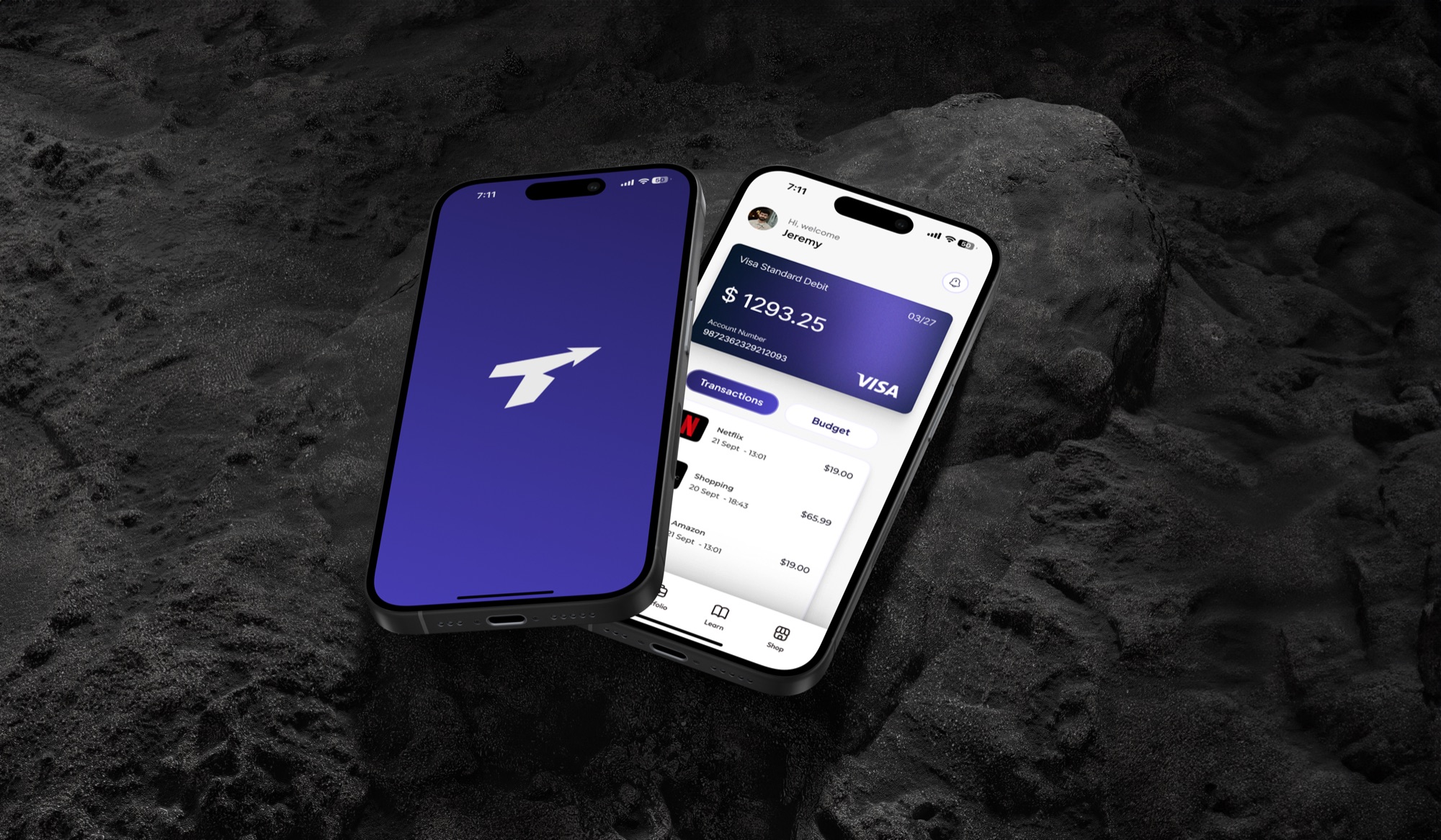
Thrive is a gamified financial mobile app designed to bridge the gap between financial education and Gen Z. The concept originated from personal experiences navigating money management without guidance, a gap validated through surveys, focus groups and industry mentor sessions. The project followed a full UX process: from concept definition and desktop research, through persona creation and user-journey mapping, to low/mid/high-fidelity prototyping and iterative testing, culminating in a complete brand identity and high-fidelity Figma prototype. Thrive was created as my university capstone project; it is a fictitious concept rather than a commercially shipped product.
A full end-to-end UX process
I led Thrive solo from concept to high-fidelity prototype. Along the way I ran primary research (a 40-respondent survey, focus groups and usability testing), designed all four core flows, and built the complete brand identity from the logomark and colour system to custom iconography. Each stage, from paper to low-, mid- and high-fidelity, was shaped directly by user testing and peer feedback.
Most Gen Zs lack access to engaging, beginner-friendly tools for building financial literacy, and financial education is largely absent from the curriculum.
Simplify the complex
Deliver accessible, bite-sized lessons that simplify saving, investing and budgeting so people can eventually apply them.
Motivate through gamification
Use streaks, challenges and rewards to motivate consistent learning and encourage healthy financial habits.
Make it practical
Provide interactive quizzes and simulations that translate knowledge into real-world decision-making in a low-stakes environment.
Connect real money
Act as a third-party platform where users can connect existing accounts, track spending and manage money alongside learning.
Researching the landscape
Research began with desktop research into UX/UI best practices, gamification studies (Duolingo's streak model) and the financial landscape for Gen Z. This was followed by design-precedent analysis of WeMoney and Wise, a primary survey of 40 respondents aged 18–26, and sessions with an industry mentor, all of which shaped the personas and app direction.
Desktop & gamification research
UX/UI best practices and gamification studies on how streaks and rewards improve retention.
Competitor analysis
Design-precedent analysis of WeMoney and Wise to map conventions and gaps in the market.
Primary survey
40 respondents aged 18–26 surveyed on financial stress, habits and learning preferences.
Mentor sessions
Recurring sessions with an industry mentor to pressure-test direction and scope.
Defining who we're designing for
Survey and research insights were distilled into two primary personas representing the spread of the target demographic, from a young professional ready to invest to a student trying to build their first habits.

David, 23 · Teacher, Melbourne
A primary-school teacher a few years out of uni, wanting to invest his savings. Gets conflicting advice and finds bank websites vague. Needs beginner-friendly education and simple breakdowns of investment options.

Marina, 20 · Student, Sydney
A uni student who loves spending on experiences but struggles to save. Overwhelmed by jargon and a short attention span for traditional education. Needs simple, engaging lessons and encouraging, not preachy, motivation.
From cluttered concepts to a focused flow
Early conceptual sketches — a home dashboard, savings-goal ring, learning screen and multiple-choice quiz — were flagged by peers as too congested, with too much information per screen. Rather than carry a cluttered idea forward, the concept was stripped back and its structure mapped deliberately: a site map and an end-to-end user flow that made every path intentional before a single screen was designed.
With the architecture and journeys settled, the site map and user flow became the blueprint for the first screens. Each node and path was sketched as low-fidelity wireframes — fast, throwaway layouts that turned the mapped structure into tangible screens, ready to be tested before any time went into visual design.
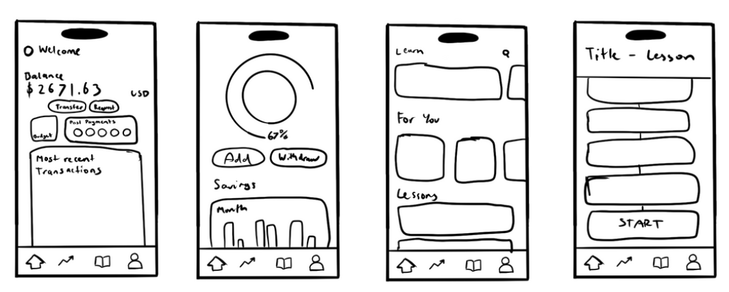
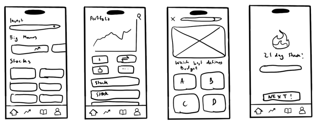
Testing the low-fidelity screens
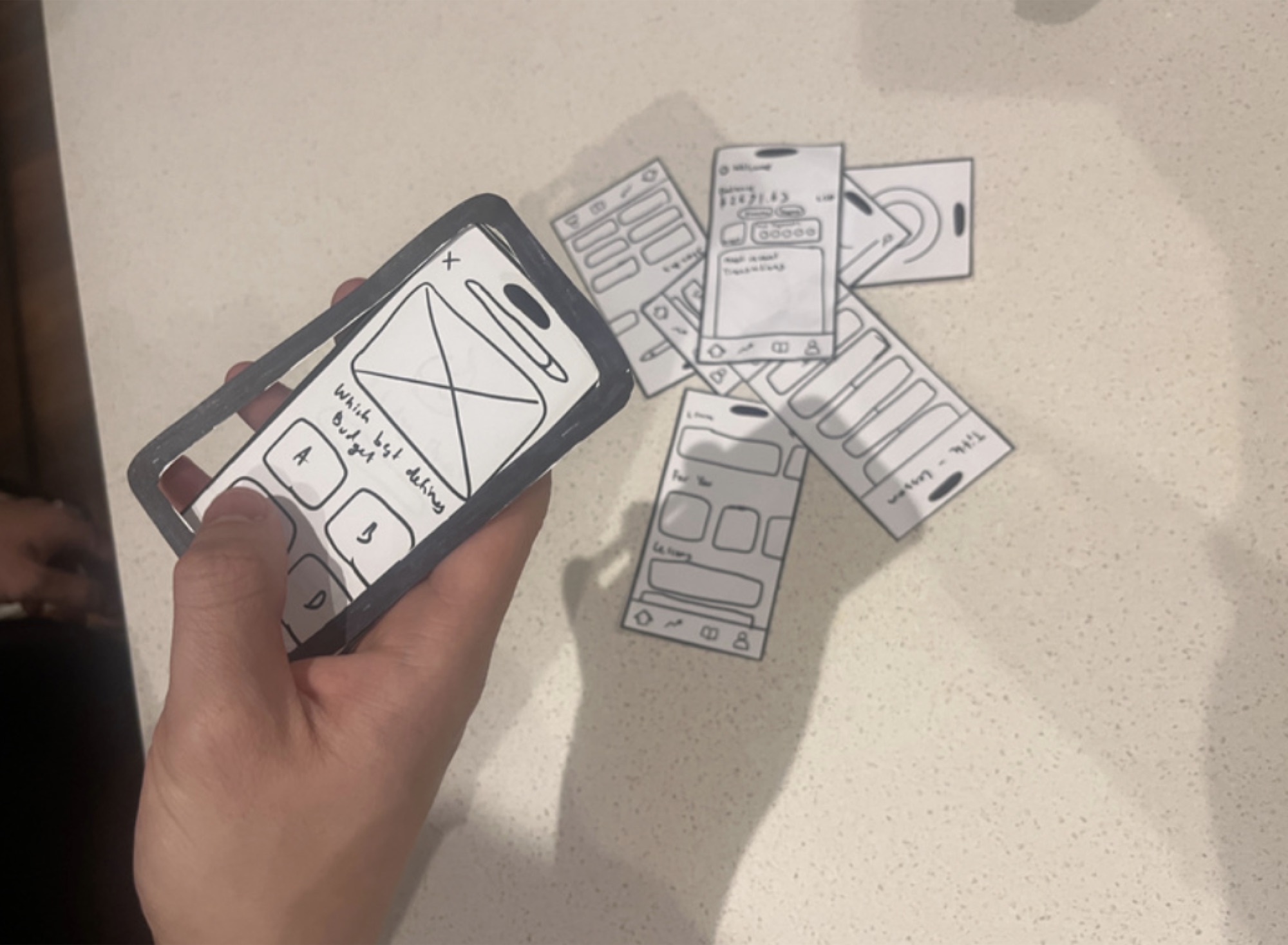
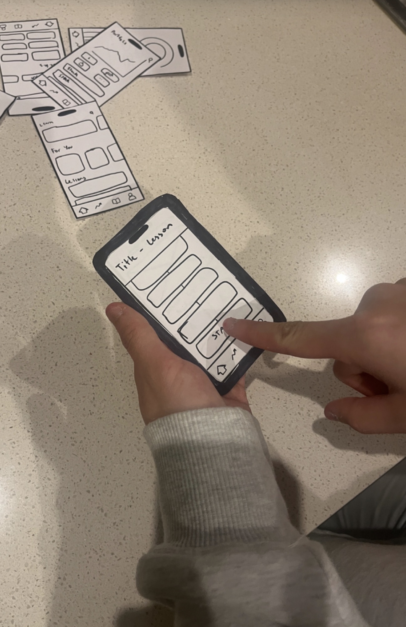
The low-fidelity wireframes were printed and run as paper prototypes with uni students and young professionals — exactly the people Thrive is for. Participants completed scenario-based tasks, like tracking a recent expense or working through a gamified lesson, while thinking aloud. Testing this early and this rough meant navigation, hierarchy and lesson flow could be pressure-tested and reworked cheaply, long before any visual design existed. The sessions confirmed the gamified structure resonated, while surfacing congestion on the home and lesson screens that fed straight into the next iteration.
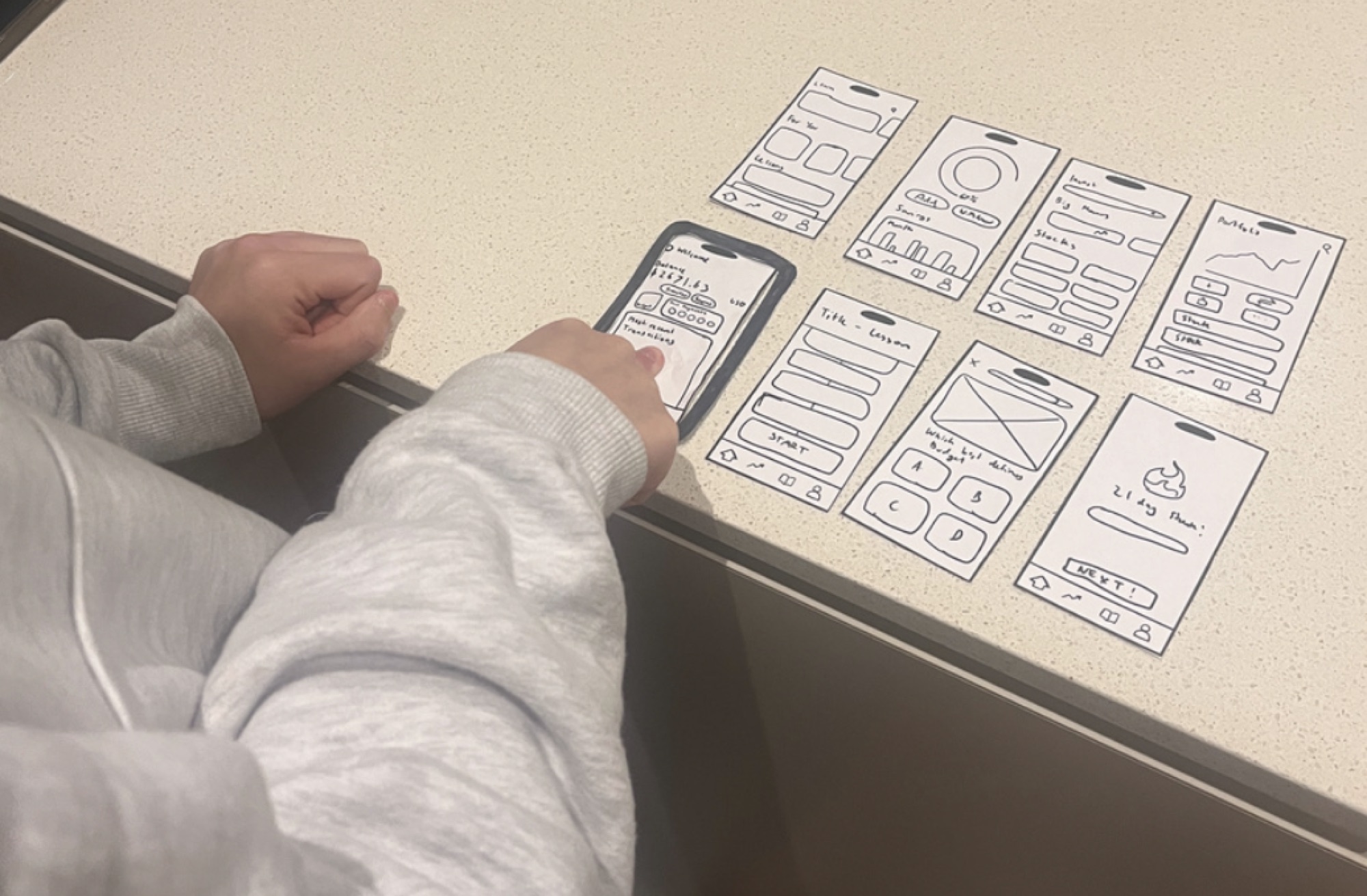
Refining into mid-fidelity
Guided by what the paper tests revealed, the wireframes were rebuilt into mid-fidelity screens — introducing colour, type and real content while cutting the information density that had tripped people up and improving lesson pacing. A second round of usability testing, followed by a post-session survey of 20 students, measured whether the changes actually landed before committing to the high-fidelity build.
The solution
The tested flows came together in a high-fidelity prototype and a full brand identity. Thrive combines real-time financial management with interactive, bite-sized learning. Inspired by Duolingo, it delivers financial education through short video lessons, quizzes and daily streaks, making learning a rewarding habit rather than a chore. Users connect existing bank accounts, track spending, set savings goals and explore investing, with a built-in reward economy (Thrive Dollars, hearts, badges) that keeps them coming back daily.
Onboarding
A guided multi-step setup that personalises Thrive from the very first screen, reducing overwhelm and matching difficulty to each user.
Tutorial
Intro prompts walk new users through what Thrive does before they commit.
Login & sign-up
Quick social or email sign-up gets people started in seconds.
Questionnaire
A short financial-knowledge quiz ranks each user (e.g. Intermediate) so content lands at the right level from day one.
Home / finance dashboard
A calm, non-intimidating home base that ties real-world money management to the learning experience.
Budgeting
A budget-breakdown view across linked accounts surfaces where money actually goes.
Saving
Set and track savings goals alongside everyday spending.
Account management
Card-scanning onboarding and a combined net-worth view across all linked accounts.
Learning page
A module-based learning hub built like a game, turning financial education into a daily habit.
For You lessons
A personalised feed surfaces the most relevant lesson to take next.
Modules & lessons
Presenter-led short-form video broken into bite-sized, digestible modules.
Questions
Multiple-choice and word-matching exercises with a hearts/lives system.
Rewards & streaks
Daily streaks and in-lesson rewards (+25 Thrive Dollars) keep the loop going.
Investing page
A simplified, guided investing experience that translates lessons into low-stakes, real action.
Portfolio management
A clear overview of holdings and performance at a glance.
Explore stocks
Discover stocks by category, with a detail view showing chart, volume and market cap.
Purchase order
A custom purchase-amount numpad and payment selection make buying approachable.
Stock management
Review and manage existing positions over time.
In-app shop
A reward economy that reframes the cost of failure and gives the in-app currency real utility.
Redeem rewards
Thrive Dollars buy hearts (extra lives), stopwatches (time extensions) and more.
Earn as you learn
Currency is earned through lessons, daily streaks and quests, making progress feel rewarding rather than punishing.
Thrive evolved significantly through continuous collaboration with peers, tutors and industry mentors at every stage, not just at the end. The project reinforced that strong design is about iterating with real users, staying grounded in data, and remaining open to reshaping work when feedback demands it. For future development, AI integration would be explored to create tailored learning paths, community challenges and improved accessibility.
Key achievements
- Designed a complete high-fidelity Figma prototype across four core flows: onboarding, finance, learning and investing
- Built the full Thrive brand identity: gradient logomark, colour system, typography and custom iconography
- Validated the concept through a 40-respondent survey, focus groups and mid-fidelity usability testing
Lessons learned
- Scope management: refocusing from many lengthy topics onto 'financial confidence' through short, repeatable challenges created far more impact
- Information density: early screens were too congested and took several rounds of iteration to simplify into a clear hierarchy
- Balancing education and entertainment: engaging without being trivial required careful, test-informed pacing
- Translating competing feedback: filtering input from mentors, peers and users meant constantly staying grounded in real needs